
“Content is like water.” It has been rightly quoted as it continues to explain how water fits in every space. Correspondingly, the content/web design should be developed in a way that it fits all screens. Responsive web design (RWD) is currently in demand for it is one such approach that employs the usage of adaptable images and layouts. As a result of which the web pages detect the size of the screen and modifies the layout accordingly.
At Webredas, we understand the necessity of screen resolutions hence we apply the use of CSS, CSS2 & CSS3. Consequently, supplying style sheets based on media queries, resources as well as viewpoints. A grid layout is flexible and adapts itself to the screen size. In like manner, it also makes use of percentage in substitute to fixed-width parameters to achieve best results.
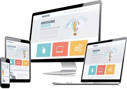

Our commercial world is so much smart-phone friendly. A mobile responsive website adapts the size of the visitor’s viewport. A mobile responsive website takes considerably less time than making a standalone mobile application in addition to standard desktop website. Mobile users generally obtain short attention span; the websites which are not mobile friendly tends to take longer time to navigate which creates a sort of frustration among the users. In this way you can lose traffic.
Webredas Technologies optimize mobile site and provide a much better user experience for the visitors. Our developer tracks user’s journey through multiple funnels, redirections to manage the website to get fitted in each type of devices.
Thank you for considering Webredas for your project.
Webredas believes in complete transparency and we develop your desired ideas about your organization. We will provide most effective solutions which will increase your clienteles' upto 50%.